Machine Learning Trading
Histograms and Scatter Plots
11 minute read
Notice a tyop typo? Please submit an issue or open a PR.
Histograms and Scatter Plots
A Closer Look at Daily Returns
Let's recap how we generate daily returns from a time series of pricing data.
Given a series of stock prices, the daily return on day d is equal to the price at day d divided by the price at d - 1, minus one. For example, if the stock closed at $100 on day d - 1 and at $110 on day d, the corresponding daily return is:
110 / 100 - 1 # = 1.1 - 1 = 0.1 = 10%Let's look at a plot of daily return data.
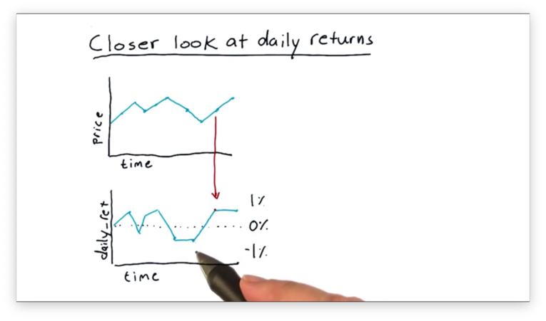
It's hard to draw any exciting conclusions by looking at this data on a day-to-day basis. There are more illustrative ways to visualize this data, and this lesson considers two types of visualizations: histograms and scatter plots.
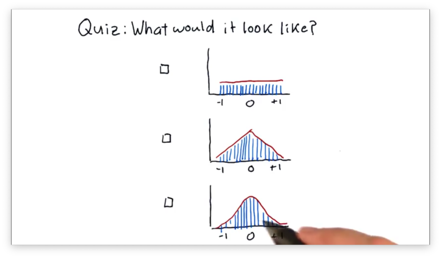
Let's start by looking at histograms. A histogram is a type of bar chart in which all possible values are segregated into bins, and the height of each bin corresponds to the number of data points in that bin.
What Would it Look Like Quiz
Suppose that we've taken all of the SPY pricing data from over the years, generated an array of daily returns, and created a histogram from those returns.
Which of the following shapes would the histogram most likely have?
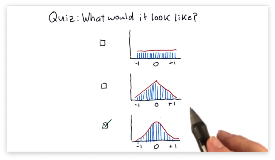
What Would it Look Like Quiz Solution
Histogram of Daily Return
There are several statistics we can compute that help us characterize our histogram.
For example, we might be interested in the mean, which tells us the average return, or the standard deviation, which gives us information about how the data is distributed about the mean.
Another significant statistic is kurtosis. Kurtosis describes the tails of our distribution; specifically, kurtosis gives us a measure of how much the tails of our distribution differ from those of a Gaussian, or normal, distribution.
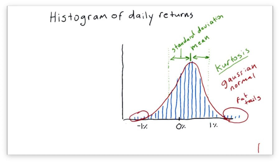
In our case, we have "fat tails", which means that our data contains more values further from the mean than we would see if the distribution was completely normal. If we were to measure the kurtosis, we would get a positive value.
On the other hand, a negative kurtosis indicates that there are fewer occurrences in the tails than would be expected if the distribution in question was normal.
How to Plot a Histogram
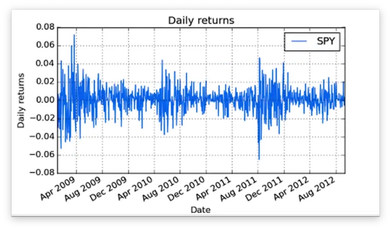
Let's look at the daily returns for SPY from 2009 through 2012.
We want to turn this data into a histogram. Of course, we can't create any plots without matplotlib:
import matplotlib.pyplot as pltGiven a DataFrame df of SPY daily returns, we can create a histogram with one line of code:
df.hist()Let's see the plot.
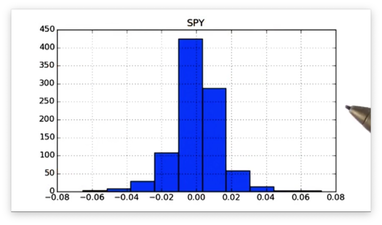
Note that we did not specify the number of bins that we wanted to use in our histogram, so we were given ten, the default. Of course, pandas is flexible and lets us supply the number of bins using the bins keyword:
df.hist(bins=20)Let's see our new histogram.
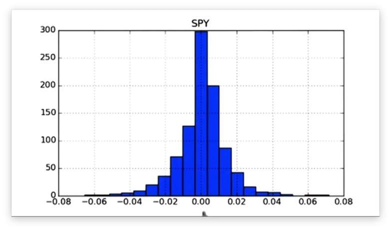
Notice that the width of each bar has decreased, and the number of bars has increased.
Documentation
Computing Histogram Statistics
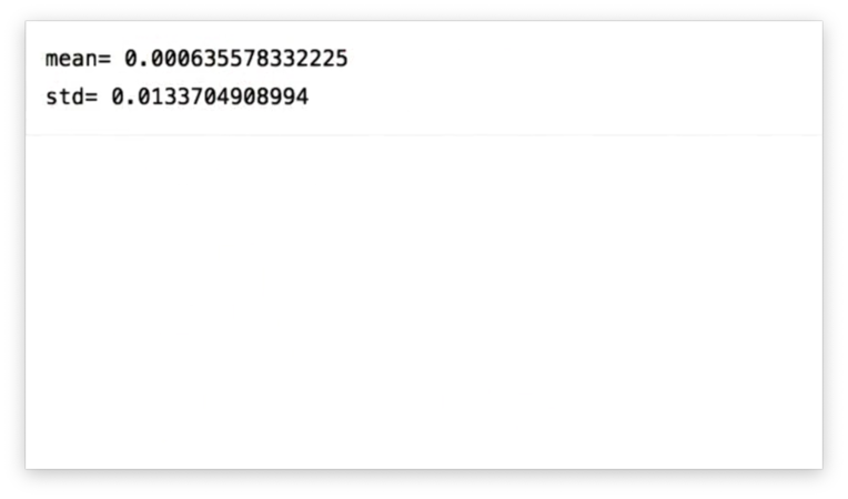
We can calculate the mean mean and standard deviation std of the SPY daily returns in our DataFrame df:
df['SPY'].mean()
df['SPY'].std()
If we print out these values, we see the following.
We want to add these values to our daily returns histogram plot. Thankfully, matplotlib exposes an axvline method that allows us to draw vertical lines on the current graph.
We can draw a vertical line at the x-value of mean like so:
plt.axvline(mean, color='w', linestyle='dashed', linewidth=2)This method call instructs matplotlib to draw a white, dashed line of width two at the x-value of mean.
Let's see how it looks.

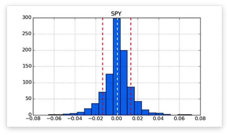
We can draw a vertical line at the x-values of positive std and negative std like so:
plt.axvline(std, color='r', linestyle='dashed', linewidth=2)
plt.axvline(-std, color='r', linestyle='dashed', linewidth=2)
These method calls instruct matplotlib to draw a red, dashed line of width two at the x-value of +std and -std.
Aside: I think what she meant to do was plot the standard deviation on either side of the mean:
plt.axvline(mean + std, color='r', linestyle='dashed', linewidth=2)
plt.axvline(mean - std, color='r', linestyle='dashed', linewidth=2)
If we plot these lines, we see the following figure.
We can retrieve the kurtosis of our daily returns data using the kurtosis method:
df.kurtosis()If we print the kurtosis, we get a positive value, which confirms that we have the "fat tails" described above.
Documentation
Compare Two Histograms Quiz
A common practice in finance is to plot histograms of the daily returns of different stocks together to assess how the stocks relate to each other.
Below are the daily returns histograms for SPY and XYZ, as well as three statements describing the relationship between the two.
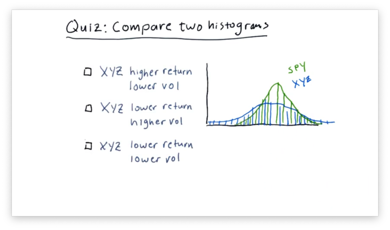
Which statement do you think is correct?
Note that "vol" refers to volatility and not volume.
Compare Two Histograms Quiz Solution
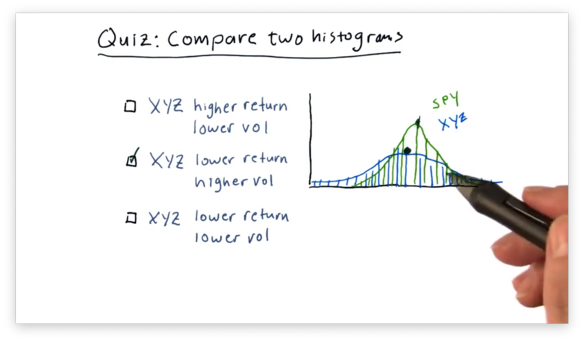
We can see that the mean of SPY is slightly higher than the mean of XYZ, indicating that SPY outperforms XYZ.
Additionally, we can see that the XYZ curve is "flatter" than the SPY curve. This feature indicates that the daily returns of XYZ are more spread out than those of SPY, which are more centralized.
In summary, XYZ has both lower returns and higher volatility than SPY.
Plot Two Histograms Together
Now we want to plot two histograms: one for SPY daily returns and one for XOM (Exxon) daily returns.
Given a daily_returns DataFrame that contains daily returns for SPY and XOM, we can create the two histograms we need like so:
daily_returns.hist(bins=20)If we print the histograms, we see the following.
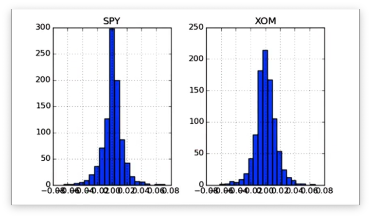
Notice that we have two distinct subplots. Instead, we want the histograms to share an x- and y-axis so that we can more easily compare the data. We can accomplish this like so:
daily_returns['SPY'].hist(bins=20, label="SPY")
daily_returns['XOM'].hist(bins=20, label="XOM")
plt.legend(loc="upper right")
The label parameter we pass to the hist method helps us differentiate the plots by adding labels to the legend generated by the legend method.
Let's take a look at the histograms.
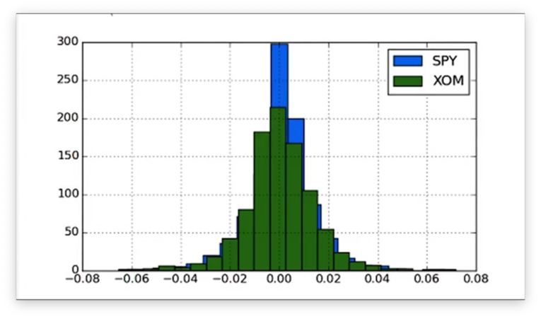
Now that the histograms are on the same axes, we can compare their peaks and tails more easily.
Documentation
Scatterplots
Let's compare the daily returns of SPY and XYZ.
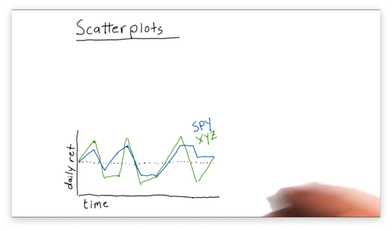
We can see that XYZ frequently moves in the same direction as SPY, although sometimes it moves further. Occasionally, SPY and XYZ move in different directions.
We can use a scatterplot to visualize the relationship between SPY and XYZ better. A scatterplot is a graph that plots the values of two variables along two axes.
In our case, we plot the daily returns of SPY against the daily returns of XYZ. Each day in our original data becomes a point in our scatterplot: the value of the x-coordinate is the SPY return, and the value of the y-coordinate is the XYZ return.
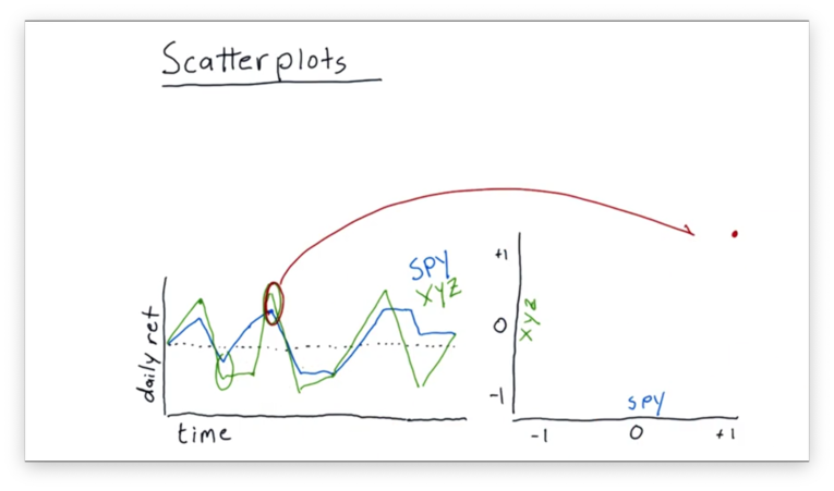
Let's consider the daily returns circled above. On this day, the return of SPY was about 1%, while the return of XYZ was slightly higher. These returns map to a point of (1, ~1.05) on our scatterplot.
Let's consider another example.
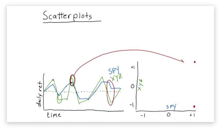
On the second day circled above, SPY and XYZ were moving in different directions. SPY was in positive territory, while XYZ was in negative territory. These returns map to a point near (1, -1) on our scatterplot.
We can continue this process to fill out our scatterplot.
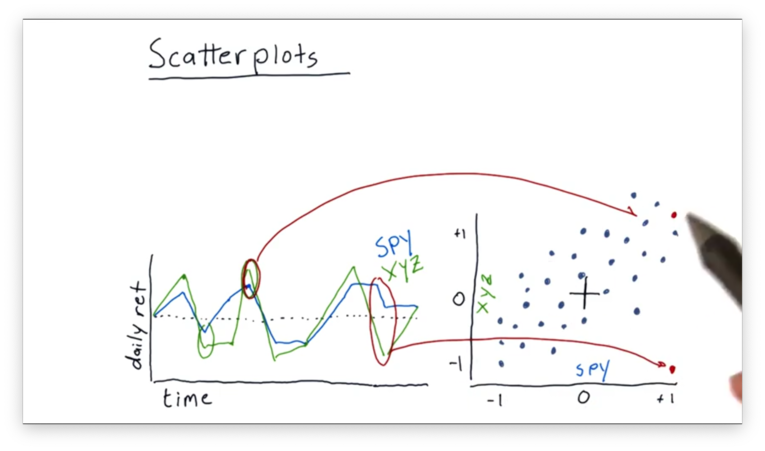
Even though the data points are somewhat scattered, we do see a relationship between the daily returns of SPY and XYZ.
Fitting a Line to Data Points
It's relatively common practice to take this scatterplot of daily return data and fit a line to it using linear regression.
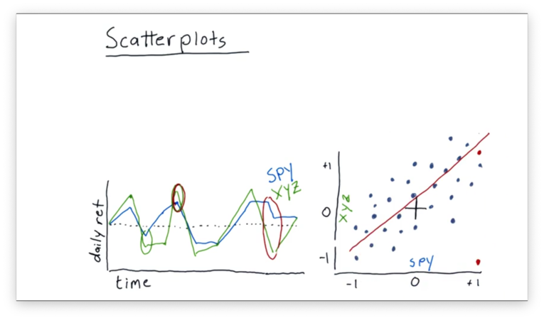
We can look at some properties of this best-fit line. One property we might be interested in is the slope. Let's assume for this example that the slope is 1.
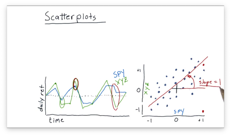
In financial terminology, the slope is usually referred to as beta. Beta indicates how reactive a stock is to the market.
In our example, we have a beta of one. This value of beta indicates that, on average, when the market goes up one percent, this particular stock also goes up percent.
If we had a higher beta, like 2, we would expect our stock to move by two percent every time the market moved by one percent.
We can also consider another property of the best-fit line: the y-intercept. This value, called alpha, indicates how well the stock performs, on average, relative to the market.
If alpha is positive, as is the case here, it means that the stock is outperforming the market, on average. On the other hand, if alpha is negative, it means that the stock is performing worse than the market.
Slope Does Not Equal Correlation
Many people mistakenly confound slope and correlation; in other words, if they find that the slope of the line that fits the data is one, they assume that the data must be correlated.
This assumption is not correct. For example, we can have a shallow slope and a high correlation, or a steep slope and a low correlation.
The slope of the best-fit line is nothing more than a property of that line. On the other hand, correlation measures the interdependence between two variables - the performance of a stock and the performance of the market, for example.
Correlation values run from zero to one, where zero means no correlation and one means perfect correlation. We can assess correlation visually by examining how "tightly" the data points in our scatterplot surround the best-fit line.
Correlation vs. Slope Quiz
Given what we just learned about correlation and slope (beta), let's look at two scatterplots with their best-fit lines, and choose the most accurate statement.
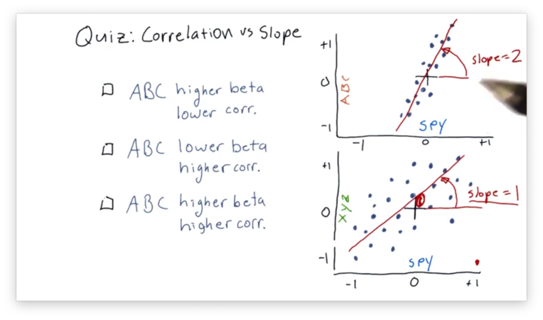
Correlation vs. Slope Quiz Solution
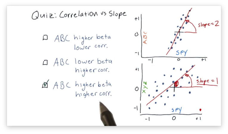
The best-fit line in the SPY vs. ABC scatterplot has a higher beta because that line has a larger slope than the corresponding line in the SPY vs. XYZ plot.
Additionally, the SPY and ABC daily returns are more highly correlated, which can be determined visually from examining how "tightly" they hug the best-fit line in the SPY vs. ABC plot.
Scatterplots in Python
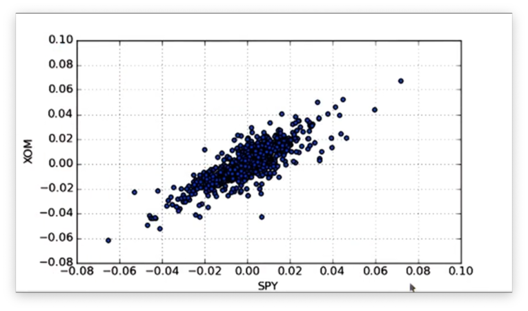
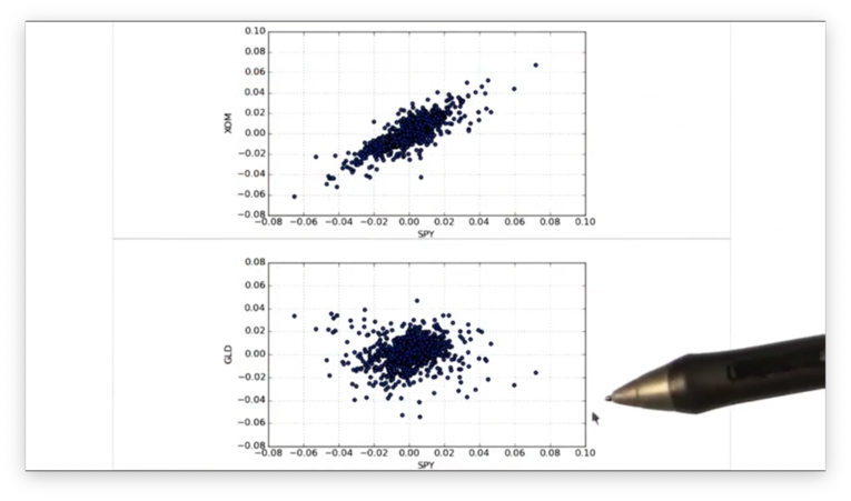
In this section, we are going to compare the scatterplots of SPY vs. XOM and SPY vs. GLD.
Given a DataFrame daily_returns containing daily return data for SPY, XOM, and GLD, we can create a scatterplot of SPY vs. XOM like this:
daily_returns.plot(kind='scatter', x='SPY', y='XOM')Note that because we have more than two columns in daily_returns, we have to specify which columns we want to plot along our axes.
Let's look at our first scatterplot.
Similarly, we can create a scatterplot of SPY vs. GLD from the same DataFrame:
daily_returns.plot(kind='scatter', x='SPY', y='GLD')Let's look at the scatterplots side by side.
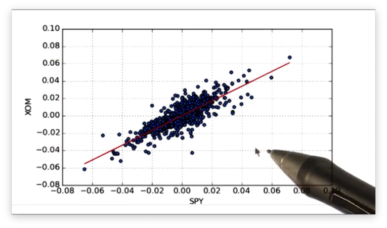
With our two plots in hand, we now want to fit a line to the data in each plot. For that, we need NumPy.
Assume we have an array-like object of independent variables x and a similar object of dependent variables y. We can compute the slope m and intercept b of the best-fit line mapping x to y like so:
m, b = np.polyfit(x, y, 1)Note that we pass 1 to specify that we want a first-degree polynomial: a straight line.
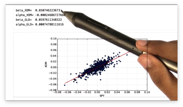
Back to our context, we can calculate the beta (slope) beta_XOM and alpha (y-intercept) alpha_XOM values of the best-fit line for SPY and XOM like this:
beta_XOM, alpha_XOM = np.polyfit(daily_returns['SPY'], daily_returns['XOM'], 1)Now that we have alpha_XOM and beta_XOM, we can calculate the y-values of the best-fit line using the SPY data as the x-values:
beta_XOM * daily_returns['SPY'] + alpha_XOMWe can plot the best-fit line accordingly:
plt.plot(daily_returns['SPY'], beta_XOM * daily_returns['SPY'] + alpha_XOM, '-', color='r')Note that we include the last two parameters to get a red line plot.
Let's look at the best-fit line.
If we print out the alpha and beta values for the XOM line and the GLD line, we see the following.
Remember that the beta value shows how a stock moves with respect to SPY. We can see that the beta value for XOM is greater than that for GLD, which means that XOM is more reactive to the market than GLD.
Remember also that the alpha value shows how well a stock performs with respect to SPY. We can see that the alpha value for GLD is higher than that for XOM, which indicates that GLD performs better, relative to SPY, than XOM.
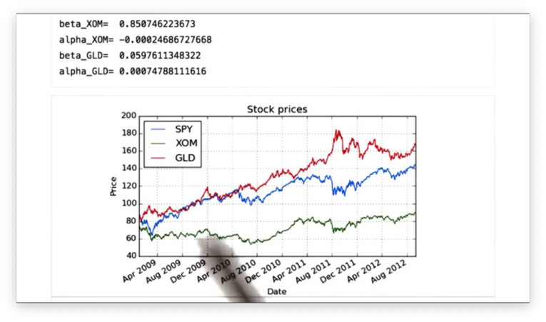
The following graph of prices confirms that GLD outperforms SPY, and SPY outperforms XOM.
Finally, we can find the correlation between the daily returns of SPY, XOM, and GLD with one method call:
daily_returns.corr(method='pearson')We can specify the method by which we want to calculate the correlation. We choose Pearson, the most common method.
If we print out the correlation, we see the following table.
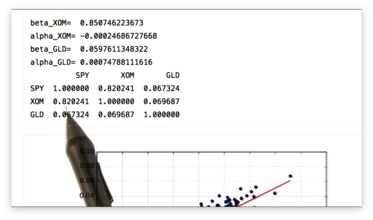
We can see that SPY and XOM are highly correlated, while SPY and GLD have a very low correlation.
Let's check the SPY vs. GLD scatterplot and best-fit line to verify.
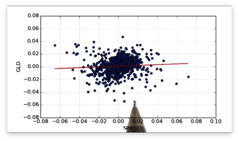
Indeed, we see that the data points do not fit the line tightly.
Real World Use of Kurtosis
In many cases, in financial research, we assume that returns are normally distributed. This assumption can be dangerous because it ignores kurtosis, the probabilities that lie in the tails.
In the early 2000s, investment banks built bonds based on mortgages. They assumed that the distribution of returns for these mortgages was normally distributed. On that basis, they were able to show that these bonds had a very low probability of default.
They made two mistakes, however. First, they assumed that the return of each of these mortgages was independent and, second, that this return would be normally distributed.
Both of these assumptions proved to be wrong as massive numbers of homeowners defaulted on their mortgages. It was these defaults that precipitated the Great Recession of 2008.
OMSCS Notes is made with in NYC by Matt Schlenker.
Copyright © 2019-2023. All rights reserved.
privacy policy